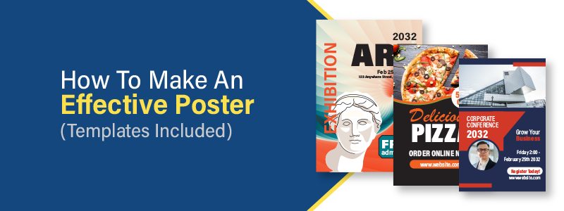
Posters are powerful tools that can serve various purposes. They can advertise events, products, services, or ideas, raise awareness around a cause, social or environmental topics, or simply promote your brand as branded signage in your office.
Whether you’re a seasoned designer or a marketer looking to create an effective advertising piece but unsure where to begin, this step-by-step guide, helpful tips, and free poster design templates will help you make a poster that grabs your audience’s attention and drives them to take action.
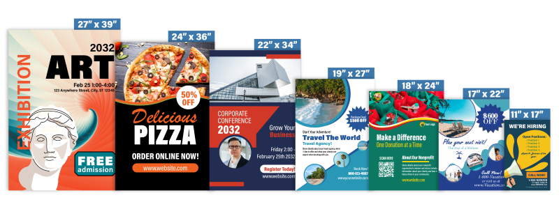
Use our free poster design templates for your selected poster size:
What is the Purpose of a Poster?
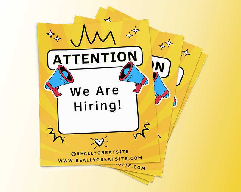
A poster is a powerful communication tool designed to visually convey a specific message or information. Its primary goal is to engage and inform an audience who is passing by efficiently. Unlike other mediums, a poster's strength lies in its ability to quickly grab attention using compelling visuals and intriguing text. While posters need to be aesthetically appealing, the clarity and relevance of the message remain important as well. Whether used for advertising, awareness campaigns, or educational purposes, a well-designed poster can leave a lasting impression, making it essential to approach its creation with strategic intent and creativity.
What Are the Benefits of Posters?
Posters offer many benefits as communication tools. Primarily, they are visually engaging mediums that can quickly grab and sustain the attention of passersby. Their large and often colorful designs make them stand out, effectively conveying essential messages at a glance. Additionally, posters allow for creative freedom, enabling brands, artists, and marketers to express messages uniquely and positively. One of the standout advantages of posters is their cost-effectiveness, providing wide exposure at a relatively low investment. They can be placed strategically in areas with traffic or specific locations to target a desired audience, amplifying their effectiveness. Whether promoting an event, launching a product, or advocating for a cause, posters remain an effective means of mass communication.
How to Make a Poster
Define the Purpose of Your Poster
Identify your poster's primary purpose or call to action so that you can begin designing it to deliver your message effectively. For example, are you advertising a film or event, promoting a sale, adding branded signage to your trade show booth, using your poster to decorate your office, sharing details about your services, or bringing awareness to a cause?
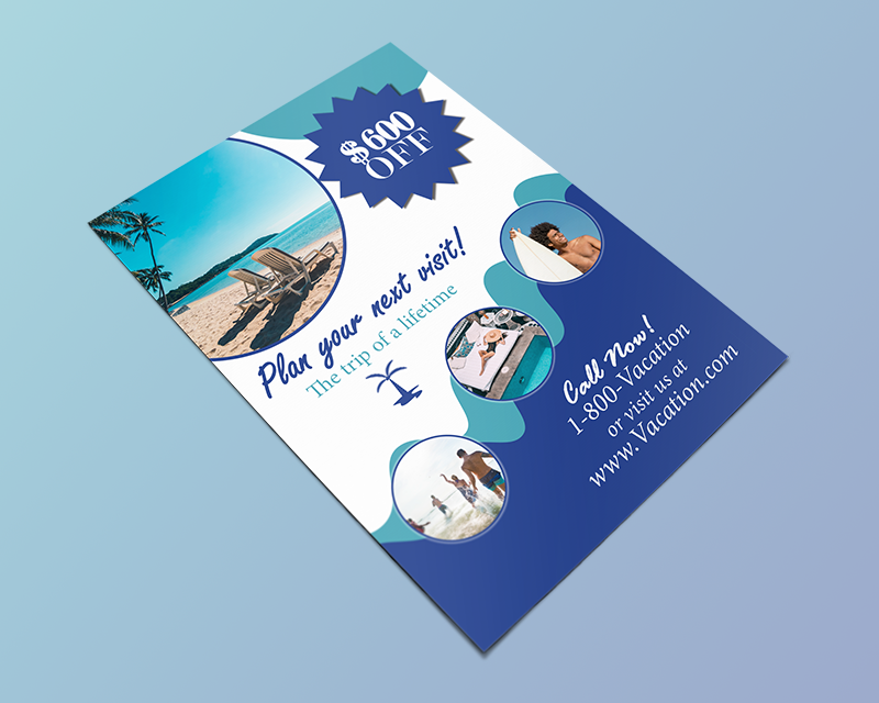
You also need a clear understanding of your target audience and the context in which your poster will be displayed.
For one, where your poster will be displayed will determine how large your poster and the font size will be. Additionally, depending on where your poster will be displayed and its purpose, your audience may consist of a wide array of demographics. If this is the case, you want to make your poster appeal to anyone who passes by, not just a specific group. Suppose your purpose is targeted at a specific group. In that case, it's important to consider their interests, age, and more, then tailor your poster design to reflect who they are.
Choose the Right Poster Size & Display Location
Your poster size will depend on the display location and your messaging. For example, if you’re placing your poster in an area where most people will be several feet away from the poster or if you’re displaying it on a large wall, then you want to choose a larger poster size like a 24” x 36”, 27” x 39”, or 22" x 34” to ensure optimal readability and to ensure your advertising message stands out in a large area.
On the other hand, if you’re placing your poster on street lights, a door, your classroom or office, as a safety notice in your facility, or as an infographic in your private practice, then a smaller poster like an 18” x 24”, 17” x 22”, or 11” x 17” may be a better size for your specific location or messaging.
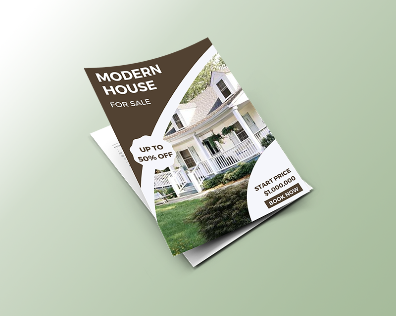
Here’s an overview of each poster size and common scenarios of when they may be the best option for you:
11" x 17” Posters: Also known as bulletin posters or tabloid-sized posters are commonly used as flyers to hang up in high-traffic areas with limited space, product advertisements, educational notifications, bulletin board updates, or event advertisements.
17” x 22” Posters: Also known as small posters, the 17” x 22” poster is commonly used for indoor advertising where wall space is limited to promote products, services, a sale, or to drive donations to a specific cause.
18” x 24” Posters: Also referred to as the medium-sized poster, these posters are often used in smaller storefront windows to advertise a sale, as well as promoting a sports event or holiday event, or display a list of menu items and services for customers to view with ease.
19” x 27” Posters: The 19” x 27” poster is the smallest of the large poster sizes, making it ideal for displaying in small areas where you want to make a big impact. For example, they’re commonly seen in doctors’ offices, clinics, retail stores, and restaurants.
22” x 34” Posters: 22” x 34” posters are one of the larger poster sizes and are perfect for event signage, promotions, or retail signage.
24” x 36” Posters: 24” x 36” posters are the most common poster size (the size you buy at the store with your favorite band or movie characters on). Various industries and business types use them. They can be used for product promotions, office branding, grand opening announcements, point of purchase displays, promoting an upcoming event, tradeshow displays, storefront displays, and more. Anywhere there is high traffic, and you want your message to stand out, is where a 24” x 26” poster is an ideal advertising tool.
27” x 39” Posters: The 27” x 39” poster is the largest standard poster size and is commonly seen at movie theaters, bus stations, and other public areas. They’re also ideal for event and tradeshow signage, restaurant signage, and any other places where you want anyone to notice it, even if they are several feet away.
Gather Your Poster Contents
Now that you have defined your poster's purpose and settled on the right size for your messaging and display location, it’s time to gather your poster contents. Here are a few things to consider including within your poster design:
High-Quality Images & Graphics: The images and graphics you choose for your poster design should reflect your poster’s purpose and target audience. Also, because posters are larger than your average printed advertisement, it’s essential that you pay close attention to image resolution. If your images have poor or low resolution, they will appear blurry when printed.
Make sure your images are at least 300 dpi in resolution and never scaled up more than 20% of their original size. For line art or non-photographic images, make sure they are scanned at 1200 dpi for best results.
Relevant Text: Posters are unique marketing tools where you don’t want to include too much information. For the most part, the goal of your poster is to provide a quick and eye-catching message that immediately makes the viewer want to take action. Everything from the headlines, subheadings, and descriptive text needs to be short, straight to the point, and compelling. Even for a poster where you might be using it as a menu sign, listing off menu items or provided services, you want to keep your text to a limit. This is so you don’t overwhelm the viewer with too much information, keep the font large enough and easy to read, and have enough space to include eye-catching design elements and imagery.
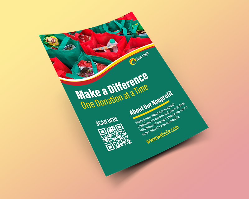
Additional Elements to Enhance Your Message: Additional design elements you need to consider including within your poster design include your logo to build brand awareness, website URL, location information, a QR code, or any other information that allows the viewer to act on what you are asking them to do.
Put Your Poster Design Together
It’s time to put your poster design together. Start by choosing the proper poster design software, such as Adobe InDesign, Illustrator, Microsoft Publisher, or Canva. Then take advantage of one of the free poster design templates at the top of this article. Each design template for its corresponding poster size includes an annotated PDF with guides on where to place your design elements so you can set up your poster design to ensure it prints at the highest quality. Next, keep the following in mind as you put your design together:
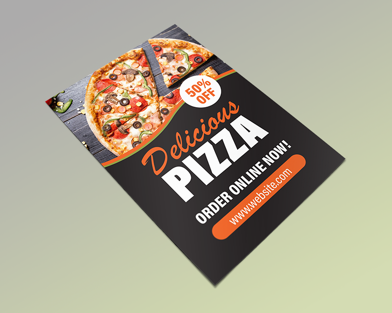
Layout Composition: Keep the composition and flow of your poster design in mind to present your information in the correct order. Establish a focal point like a main image, headline, or call to action, and then create a visual hierarchy. For example, say your image is the focal point or the element that catches the viewer’s eye first. You would then want to strategically place where your headline will be so that it’s the second thing they see. In addition to creating a focal point, you want to arrange your design elements to create balance and clarity. Don’t push elements too close together; include negative space or white space to break design elements up.
Use of Design Elements: Your image-to-text ratio needs to be balanced while including an effective compositional flow, as mentioned above. Use other design elements such as lines, shapes, color blocks, or patterns to highlight specific information and guide the viewer’s eyes from one design element to the next.
Typography & Font Size: The typeface you choose must be large and easily read. Stay clear of cursive, curly, and other fonts that can be hard to read, especially from a distance. Because your poster might be viewed by someone standing far away, it’s important that they can at least read the headline clearly from where they are standing. A minimum 24pt font size is a good place to start. Depending on your display location, poster size, and where most of your audience will be when first seeing your poster, increase the font size accordingly.
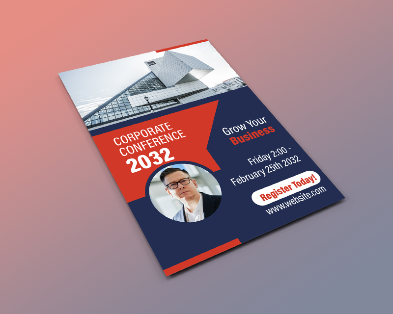
Color Choice: The colors you choose throughout your poster design must align with your brand. While colors can deviate from your brand for a specific holiday or event signage, sticking with your brand colors is ideal for building strong brand awareness. In addition, the colors you choose for your font and other design elements need high contrast to improve readability and make your sign stand out. For example, if your brand colors are dark blue, white, and bright red, you could use a dark blue background and white and red for your font and other design elements to ensure your posters are legible and eye-catching.
Incorporate Branding Elements: Including your brand’s colors is very important, and it’s also important that you include other branded elements, such as your logo and slogan, if applicable, to enhance brand recall and awareness.
Your Call-to-Action: A call-to-action or CTA is part of your poster design that prompts the viewer to respond immediately. A CTA typically includes an incentive like “buy today for 20% off” or “visit our website to learn how to increase your ROI now.” Your CTA should be large and bold so your viewers know precisely what to do. Depending on your CTA, make sure to include the proper elements the viewer needs to take action, like a QR code, contact information, business address, or social media handle.
Print & Display Your Poster
Finally, it’s time to print and display your posters! Here are a few things to consider:
The Paper Your Posters are Printed On: #80 and #100 velvet and gloss text weight paper are the most common paper options. #100 is slightly thicker than #80, and gloss text has more shine to the paper than velvet text. However, suppose you’re hanging your poster in an area prone to being touched or brushed on without placing it in a frame. In that case, you may consider using a heavier, more durable paper option like a 14pt C2S cover stock. Ask your printer about their free paper sample booklets to get an idea of the many paper options available for poster printing.
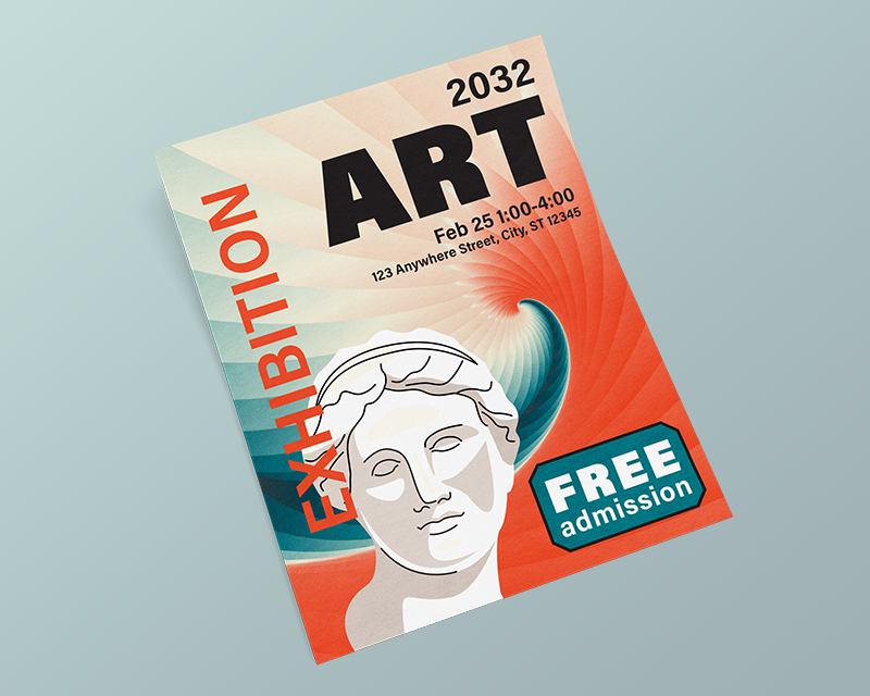
Coating: Coatings have two main benefits. For one, they can increase the durability of your poster by adding an extra layer of protection. Additionally, depending on where your poster will be displayed or what style you’re going for, you can opt for a gloss coating to add an additional shine to your sign or a matte coating to avoid glare from lighting.
Turnaround Time: How soon do you need your posters? Turnaround time refers to the time it takes to print your poster. So, for example, if you chose a 3-4 business day turnaround, once you approve your poster design proof, your posters will be printed within 3-4 business days and then shipped to you. The longer the turnaround time, the lower the printing cost will be, so it’s important to plan ahead and to try and order your posters as soon as possible so you can opt for a longer turnaround time and save some extra money.
Displaying Your Posters: Businesses often display their posters in frames to protect them, especially outdoors or in busy areas. Others opt to hang them without a frame using some type of adhesive. Regardless of how you display your posters, make sure you display them at eye level in an area where they are most likely to catch the attention of anyone who passes by.
Common Poster Design Mistakes
Including Too Much Information: Posters must communicate their message quickly and effectively. Overloading the design with too much text and imagery can overwhelm the viewer and dilute the message. To avoid a cluttered layout, include white or negative space, and don’t try to fit too many elements into your poster design.
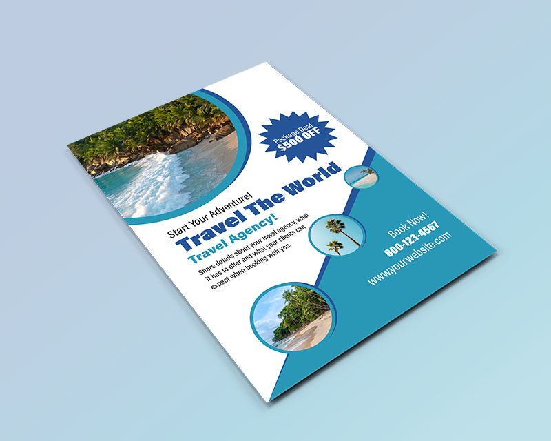
Poor Image Quality: Using low-quality or low-resolution images can make your poster look unprofessional and may not be legible when printed, especially on a large scale.
Poor Typography Choices: Using too many fonts, choosing hard-to-read fonts, placing text too close together, or not choosing a large enough font size will result in an ineffective poster.
Wrong Color Choice: Using colors that are too similar or clash, not using enough contrast throughout, or choosing colors that don’t align with your message or brand can make for a poster that doesn’t generate results.
Lack of a Focal Point: A well-designed poster must have a clear focal point to draw the viewer’s attention.
Ignoring Printing Margins: Not accounting for printing margins can result in essential design elements being too close to the edge of the paper or even cut off during the printing process. Use one of the poster design templates at the top of this article to ensure you account for the proper margin.
Conclusion
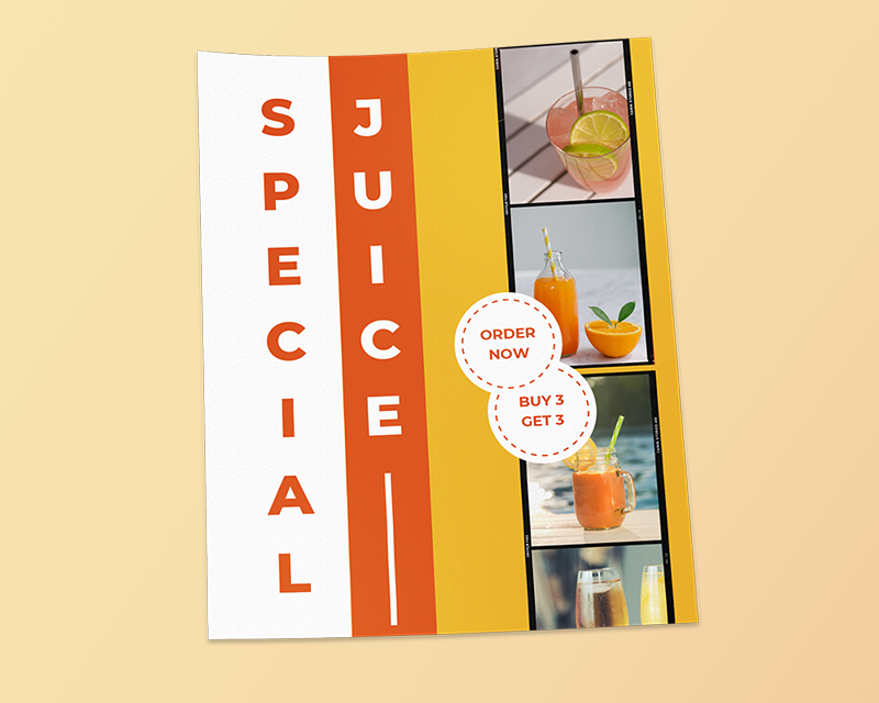
After reading through this guide and helpful tips and downloading your free poster design template, you’re ready to create a poster that communicates your message effectively. Remember, a well-designed poster has the power to quickly grab your audience’s attention and intrigue them to take immediate action.
Next, it’s time to print and display your eye-catching poster. Bring your posters to life with our high-quality and affordable poster printing services today. If you have any questions or need assistance, don’t hesitate to contact our team anytime. At Kingston Printing, our team of experts is here to help you plan, design, and bring your poster to life, all while ensuring the best price and the highest quality.
Get A Free Quote Today!


