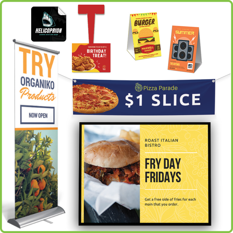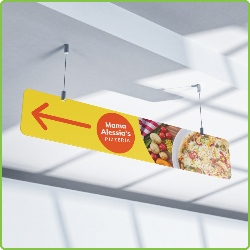
To grow your business, you need your message to be seen. There are so many advertising strategies to get your message to your audience, but there is a category of advertisements that play a crucial role.
This category is business signs. And no matter what industry you are in, you need to harness their full power through an eye-catching design.
Luckily, these tips below will help you easily design eye-catching business signs that successfully bring more people to your business.
1. Start With a Clear Understanding of Your Signs Purpose

Before you begin designing your business sign, you need to have a clear understanding of what your sign's purpose is.
Start by outlining your goal. Are you looking to design a simple logo sign to display on your storefront or are you looking to promote a huge sale or event?
No matter what your goal is, you will need to match the type of sign you choose and the design to your goal.
2. Keep Your Message Simple and Intriguing
We all know with a good design, less is more.
And there is no exception when designing a business sign and an eye-catching business sign is like a good email subject line: short, sweet, grabs the attention of the viewer, and intrigues them to want to learn more or act right away.
Whether you’re designing a sign that helps customers identify your business or are designing a promotional sign to market a big sale, you want to include clear language that gets straight to the point.
Business signs with a busy design and lengthy message won’t stand out. If you look at your sign design and there are text or design elements that don’t need to be there, remove them.
3. Make Your Sign Pop in Its Environment

Another trick to designing business sign is to take the environment of where your sign will be placed into consideration.
Depending on where your business sign will be placed needs to have influence on your color choices.
For example, if you are designing an outdoor business sign, think about the color of the exterior wall or the foliage that will be surrounding your sign. Then choose contrasting colors to make your sign pop in its environment.
Colors have a major impact on how your sign is perceived, which means you need to choose colors that reflect your brand, your message, colors that evoke a certain feeling, and colors that stand out in your sign's environment.
4. Design a Sign That Relates to Your Audience
Depending on who your audience is, you want to design your business sign specifically for them.
For example, if you are designing a sign for your family-style restaurant, then include an image of a family enjoying a meal along with a warm and inviting color pallet to let your audience know you are family-friendly and have dishes each of their family members will love.
5. Drive Attention with Great Imagery

Using high-quality imagery within your sign design is another great way to create a sign that gets attention.
Choose imagery that relates to your message. This could be as simple as your logo or a graphic, or it could be more detailed by hiring a professional photographer to capture a beautiful image of your product.
For example, lawn care company signs are more eye-catching when there is an image of a fresh cut lawn and well-crafted landscape, and restaurant signs attract more people when there is an image of a delicious entre.
6. Don’t Forget Your Logo (And Make it Stand Out!)
Never forget to include your logo and any other crucial branding elements within your business sign.
Better yet make it stand out! Place it in the center, or in every top right corner of every sign you design to build strong brand awareness through consistent branding.
Even design a sign just for your logo and brand like dimensional lettering above your business’s entrance, a logo sign to feature in your waiting room, or even a wall decal that displays your brand’s slogan above your checkout counter.
7. Keep Your Sign Designs Consistent

Once you have created the perfect sign design, you’ll want to keep that design consistent for your other business signs as well.
Of course, a new campaign can result in a new design but for the same campaign, keep all your sign designs consistent.
This will build better awareness and increase the number of people who take you up on your offer.
This also goes for your permanent signs as well. For example, if you have a blade sign, a storefront wall sign, and a window decal, you want to keep all these sign designs consistent.
This is because the more people see your logo and your brand’s main message, you will have a better chance at building strong brand awareness.
When you stick with consistent branding, your brand becomes more recognizable resulting in better business growth.
8. Choose the Right Business Sign Provider
Designing an eye-catching business sign also requires you choosing the right materials and quality.
And printers like Kingston Printing can help you bring your sign design to life by providing you with a high-quality, stunning sign that reflects and enhances the eye-catching design you created.
Click the button below to check out some of our most popular wide-format and sign options. And when you’re ready, we’ll help you create the perfect sign!
Get Started Today!


