Designing a poster, yourself may seem like a challenging task, but with the help of the following tips, these concerns shouldn’t continue to hold you back.
Posters almost always have a hierarchy that impacts the order in which viewers receive information, the feelings they associate with that information and the lasting effect that information will have on them.
The hierarchy of a poster’s information can be developed through a varying number of design elements depending on who you ask, but we've highlighted three that we think are the most important to remember in poster design.
Tip 1: Consider the Lines
A line is a mark, either visible or implied, that connects two points. These marks can be perfectly straight, zig-zagged or curved.

Lines can be used to accent or emphasize certain words or paragraphs, or they can be used to draw the viewers' attention in a certain direction in the real world (like “Head this Way” typed on a hand shaped poster with the index finger pointing to the left).
Multiple lines can form a pattern that can influence how viewers interact with your poster. Take a geometric pattern that repeats the same lines repeatedly for example. This can create a sense of structure and order, whereas curvy, unpredictable patterns can become overwhelming.
Lines don’t have to be drawn either. They can be implied by how you place and arrange images and text in your poster's design.
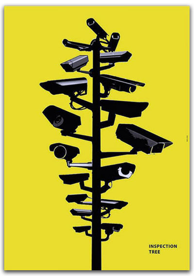
Try using lines to direct viewers through a visual idea. For example, the poster on your right. The lines direct the eye from the top to the bottom of the poster and then landing the eye on the title “Inspection Tree.”
The lines in this poster are very direct. It makes the poster have a much larger impact since the reader doesn’t have to spend much time or energy reading lots of information.
Tip 2: Consider the Weight
The visual weight is relative and functions similarly to lines as it affects the order in which readers receive information and what the eye lands on when first viewing an image. You can create weight in many ways when designing a poster, but the key ones to remember are color, space, and balance.

Colors that are darker have more visual weight than lighter colors. The weight darker colors have, draws the viewers’ eye in.
Space can be manipulated by controlling the distance that you leave between images and text on paper. For example, if you had an image of a crowd of people, the weight would be heaviest in whichever part had the most people in it. Where it’s less “busy” in an image is where there is a greater amount of space and therefore less visual weight.
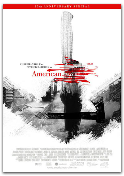
For example, this poster for “American Psycho” has the most weight in the word “Psycho.”
Even though it’s written in white typeface, it uses elements of weight to draw the reader’s attention to that word. The space immediately around the word “Psycho” is very busy and it has action created through lines and colors. This part of the poster has a lot of edges between colors, creating the chopped up and busy feeling that gives it so much weight.
Red is also a color that naturally draws attention as it is commonly associated with aggression and passion. When a person looks at an image that has red in it, it’s likely the very first thing they’ll notice or that their eyes will be drawn to which makes the red part in this poster bear the most weight.
Tip 3: Consider the Typography
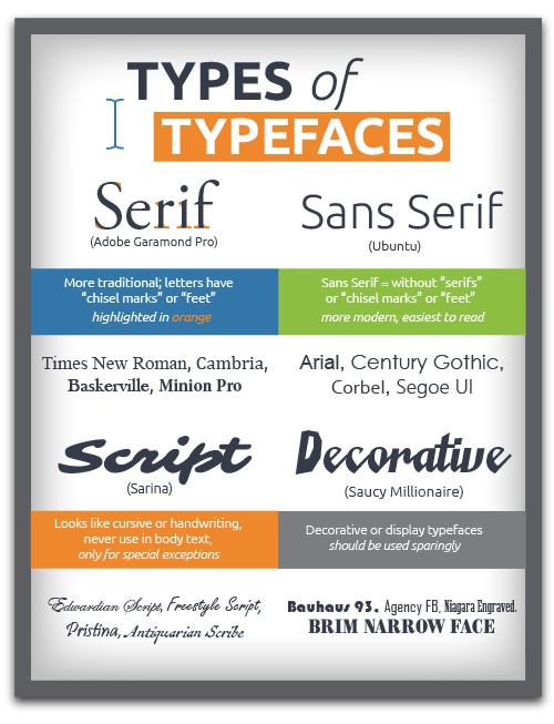
Typography is the arrangement and selection of typefaces (or fonts) to make the text in a design more legible and appealing and is what sets the tone of your poster and affects the order your viewers will read the words in your poster.

Sometimes, as in the “American Psycho” poster above, the typefaces are intentionally different and spaced in an uneven fashion to create a disharmonious typographic effect that visually represents the tone of the posters message. Typography can also evoke certain feelings and memories.
If you’ve ever used a Microsoft Office product, you have probably come to know the fonts (or typefaces) Times New Roman or Comic Sans.
Times New Roman, while widely accepted as a professional and appropriate typeface for bodies of text, emails or memos, doesn’t appear very professional when enlarged and positioned as a title on your poster.
Regarding Comic Sans: this typeface is one of the few that have become clichés that are widely considered tacky and humorous.
Picking a typeface that will work involves a lot of thinking, comparing, and testing. The trick is to go off the beaten path to find clean, modern typefaces that are going to be legible given the sizing and spacing you want them to be on your poster.
Google Fonts is a great library to start with since it features over 800 professional-grade typefaces that are open source, meaning you can use them for any application without worrying about copyright.
Keep in mind that certain texts that are appropriate for titles may not be appropriate for the body text of certain posters, and vice versa.
Google fonts are almost universally available to anyone, and they are all downloadable, making them fully accessible for use in poster design.
Make sure to try out fonts you may be unfamiliar with so you can make your poster stand out through diverse font pairings.
Ready to get started? Contact us to get started on your poster print project today!


