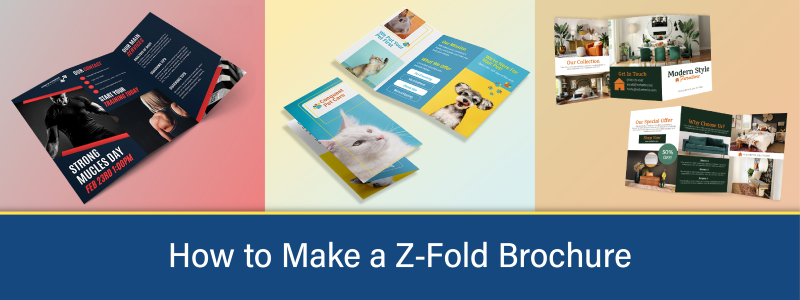
The z-fold brochure is a versatile, affordable, and effective marketing tool for conveying a sequence of information or a story that unfolds in stages. Yet, making a z-fold brochure can be difficult if you don't have the experience, right approach, or tools.
Whether you're a designer looking to create an event brochure, a business owner wanting to promote your services, a healthcare provider looking to share statistics, a nonprofit looking to spread the word of your good cause, an entrepreneur looking for the right communication tool, or a marketer advertising products, this step-by-step guide and provided free design templates will ease the process of making a z-fold brochure that generates impressive results.
Use our free z-fold design templates for your selected trifold brochure size:
What is a Z-Fold Brochure?
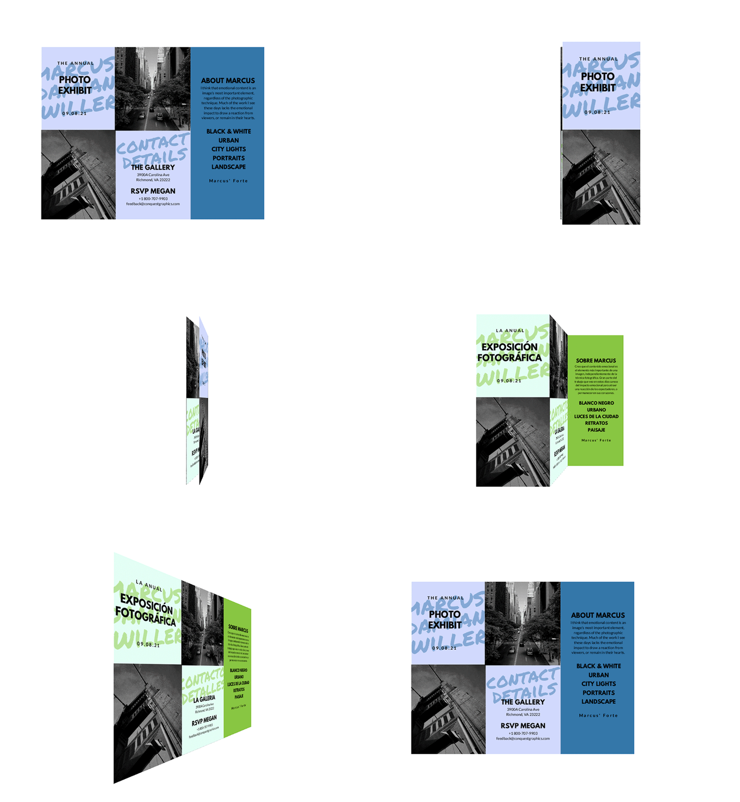
A z-fold brochure, commonly referred to as a zigzag or fan-fold brochure, features a distinct folding pattern where each panel folds in an alternating manner, creating a "Z" shape when viewed from the side. Typically crafted from paper sizes like 8.5" x 11", 8.5" x 14", 11" x 17", 11" x 25.5", or 12" x 9", this brochure type ensures each of its three panels is equally sized and visible without overlapping. Its sequential unfolding provides a guided reading experience, ideal for step-by-step information, timelines, infographics, or progressive storytelling.
What Are Z-Fold Brochures Used For?
Z-fold brochures, characterized by their zigzag folding pattern, offer a sequential reading experience across three equally sized panels. Often resembling a small accordion when fully expanded, z-folds are especially valuable for designs with a continuous design flow or narrative across the entire spread. Beyond aesthetic appeal, their structured layout makes them popular for presentations, instructional guides, product or service promotions, company introductions, and event timelines. Additionally, their compact nature upon folding is ideal for direct mail campaigns, as they fit neatly into envelopes without needing additional adjustments or can be mailed as a self-mailer, where an envelope is not required.
How to Make a Z-Fold Brochure
Determine the Purpose & Content for Your Z-Fold Brochure
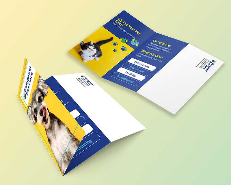
What is your brochure's primary objective or goal, and who is your target audience? It’s important to answer these questions because when designing your brochure, you need the messaging, imagery, and other design elements to align with your purpose and reflect your target audience. For example, did you just open your veterinary clinic and looking to send your brochure to a new local audience? An event organizer promoting an upcoming cultural event itinerary? Or a furniture store advertising its new line? What demographic does your target audience fall under? What are their interests and needs?
Knowing the primary purpose of your z-fold brochure and identifying your target audience will make the following steps of making your z-fold brochure easier. For example, suppose you are creating a cultural event brochure. In that case, you need to choose imagery and language related to those interested in attending your event. Suppose you are promoting your grand opening or your veterinary clinic. In that case, you’ll want to target pet owners, include images of happy pets, and share details about how you put your clients' pets’ health first.
Choose the Right Z-Fold Brochure Size
There are a few things to consider when choosing the size of your z-fold brochure. For one, if you are mailing your brochures as self-mailers—brochures are mailed without needing an envelope—then you need to keep the mailing panel in mind. The mailing panel is a 4” x 2.25” area you must leave blank on the back panel of your z-fold brochure so that the mailing information, such as the delivery address and mailing indicia, can be placed. Suppose you require a lot of imagery and text in your brochure design. In that case, you may need to choose a larger brochure size to compensate for the space lost due to the mailing panel.
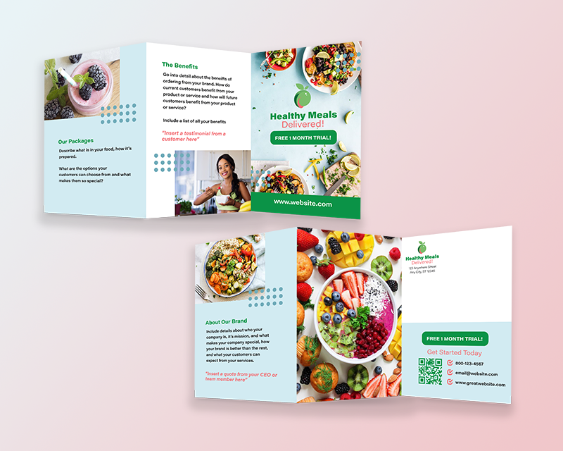
Second, depending on the purpose and the content you need included within your brochure, you may need a smaller or larger brochure size. For example, suppose you’re using your z-fold brochure as an information guide that includes infographics, timelines, and statistics. In that case, a larger brochure like a 12x9 or 11x17 z-fold will give you more space to display your content. Suppose you’re handing your brochure out at an event or tradeshow. In that case, a smaller brochure, like an 8.5x11, will be easier for your recipients to carry around.
Third, consider the panel sizes for each z-fold brochure size. Because the z-fold is folded twice in opposite directions along parallel lines, it creates 3 panels on the front and back of your brochure. The panels are a 3rd of the paper size, so if you have many details to include, small panels may make your brochure content cramped and too close together. Below are the panel sizes for each z-fold brochure size so that you can plan for what size you will need:
- 8.5” x 11” z-fold panels measure 3.66” x 8.5”
- 8.5” x 14” z-fold panels measure 4.666” x 8.5”
- 11” x 17” z-fold panels measure 5.66” x 11”
- 11” x 25.5” z-fold panels measure 8.5” x 11”
- 12” x 9” z-fold panels measure 4” x 9”
Designing Your Z-Fold Brochure
Choose the Right Z-Fold Design Software: Adobe InDesign is the preferred design software for designing a z-fold brochure. However, other suitable software includes Adobe Illustrator or Microsoft Publisher. In addition, if you don’t have the resources or access to use these platforms, there are free ones, including Canva or Scribus. Regardless of your design software, always export your z-fold design as a PDF with bleed included. Bleed refers to the area outside of the actual size of your brochure where your design elements must extend to avoid any thin white lines on the edge of your brochure during the trimming process.
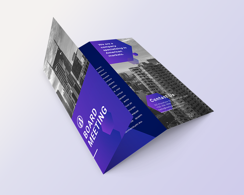
Select The Right Images, Colors, Fonts, & Design Elements: The images you include within your z-fold brochure must reflect your target audience. For example, if you’re creating a corporate event brochure, who are the type of people who will be attending? Include images that these individuals or businesses can relate to. If you create a sports event brochure, are you promoting a golf tournament or a youth soccer camp? Your images need to align with your target audience.
The colors and font you choose should be on brand. Use your brand’s colors throughout the design, and select fonts that are easy to read and align with your brand guidelines.
In addition, use design elements to your advantage. Use shapes, patterns, or lines to highlight imagery and important text. Remember that you can also stretch these elements across each panel to create a visually appealing map directing readers’ eyes from one panel to the next.
Outline The Flow of Your Brochure Content: Outline and plan for a sequential flow of information. Given the unique nature of z-fold brochures, you need to consider how you want your brochure recipients to read your content. What do you want the first elements they see to be? What do you want on the back of your brochure or the parts they will see when unfolding it and flipping it over? Where do you want your call to action, contact information, company story, or testimonials to be?
Placing Your Z-Fold Brochure Content
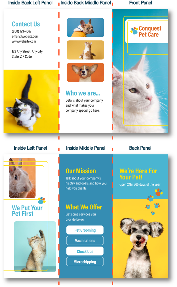
Now that your design elements, text, and images are ready, it’s time to put your z-fold brochure design together.
To get started, use one of the free z-fold brochure design templates at the top of this article. These templates include annotated PDFs that you can place within your design platform as a guide for where to place design elements so you are fully prepared to design an effective custom z-fold.
Once you have your platform and template set up, you can begin designing. Use the image in this section to reference how your panels will be displayed, and keep in mind the reading sequence, including left to right and then downwards.
Ensure text is placed within each panel and at least 1/8” of an inch away from the fold lines and edges of the paper (your template will help you with this). For design elements you want to be stretched across each panel, ensure these graphics or images expand seamlessly over the fold lines.
Finalize & Print Your Z-Fold Brochures
Once your z-fold brochure design is completed, take a moment to proofread your content. Check for grammatical errors, design inconsistencies, image quality, and lack of logo and other branded elements. Ensure all key information is included and easy to understand, your headlines are bold and compelling, and your main copy is short yet descriptive and engaging. Then export your design as a PDF file to prepare for printing.
Consider what printing company you will use. Look for one that offers high-quality brochure printing, low prices, fast speeds, and a team of experts who can help you with every step. In addition, if you are mailing your z-fold brochures, look for a printer that also offers mailing services. This is because they can print your z-folds, prepare them for mailing, help with your mailing list, and mail them directly from their facility, so you can save time and money by not mailing them yourself.
When preparing your brochure for printing, consider the quantity and choose a quality paper stock. If you aren’t familiar with your printer’s paper options, ask them for a free paper sample booklet to see and feel what your brochure will be printed on. Next, decide on gloss, matte, or other finishes based on your z-fold brochure purpose. UV coating can increase durability if you are mailing your brochures or handing them out at a trade show.
Common Mistakes to Avoid When Making a Z-Fold Brochure
Don’t Include too Much Information
While z-fold brochures provide more space than postcards, they still have limited design space compared to catalogs. Because of this, it’s essential that you don’t include too many images or too much text. Keep text and information concise, and only include images and graphics that complement your message. Too much information can make your z-fold confusing or overwhelming, resulting in less engagement.
Pay Attention to Image Quality
Low-resolution images can appear blurry or fuzzy when you print your z-fold brochures. To avoid this, make sure all images or photos are at least 300 dpi in resolution and that they are never scaled up more than 20% to ensure the best quality.
Don’t Ignore Fold Lines & Margins
Because z-fold brochures have 2 fold lines and 3 panels on each side of the brochure, you need to remember to keep text and certain elements away from the fold lines. For the best results, keeping text and other design elements you want fully visible on a single panel at least 1/8th of an inch away from the fold lines and the edge of the paper is recommended. This spacing is referred to as margin space and is essential for printing brochures with the highest quality. By keeping the fold lines and margin space in mind, you can ensure that no design elements will be printed on the fold line.
You can avoid these issues using a z-fold design template, as they provide guidelines for where the fold lines are and what areas you need to avoid placing design elements.
Conclusion
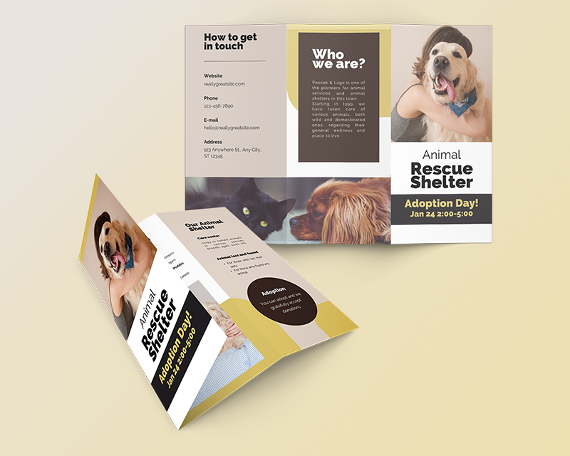
Now that you have read through the guide to making a z-fold brochure and downloaded your z-fold brochure template, you’re equipped with the knowledge and insights to create a compelling and effective marketing piece. A well-designed z-fold brochure has the power to enhance your brand’s image and captivate your audience in a memorable way.
Next, it’s time to print and distribute your eye-catching z-fold brochures. Bring your brochures to life with our high-quality brochure printing services today. If you have any questions, need design assistance, or need help with choosing your z-fold brochure specifications, don’t hesitate to contact our team. At Kingston Printing, we’re here to help you with every step of your z-fold brochure project.
Get A Free Quote Today!


