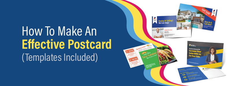
Postcard marketing has become increasingly popular among many industries. Why? Because they are an affordable, tangible, trustworthy, and quick way to get your message into the hands of those who matter most to your company. On top of that, compared to emails and display ads, they aren’t ignored or scrolled over. They are often kept for several days, increasing brand exposure and the likelihood of someone taking you up on your offer.
Whether you’re a postcard marketing pro or are looking to delve into the benefits of sending your audience a postcard, this step-by-step guide, helpful tips, and free postcard design templates will help you create a postcard that engages your audience and increases sales.
Use our free postcard design templates for your selected poster size:
Why Postcard Marketing?
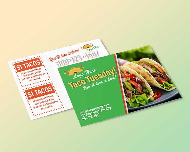
Postcard marketing stands out in the digital age for its tangible and direct approach to reaching customers and potential ones. Not only are postcards cost-effective, but their compact format makes them quick and easy for recipients to engage with. They offer businesses the dual advantage of enhancing brand visibility while conveying concise, impactful messages. In a crowded digital marketplace, the tactile experience of a postcard can create a memorable impression, creating meaningful connections between brands and their audiences.
Step-by-Step Guide for How to Make a Postcard
Understand Your Audience
Before you begin any design for a marketing campaign, you need a clear understanding of who your audience is. By identifying your target audience (whether that be your customers or a new audience), you can easily tailor your postcard design to your company's goals and your audience's interests and even personalize your design for each recipient.
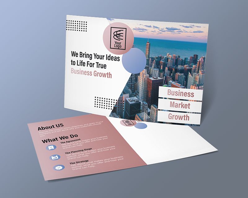
For example, a retail store advertising a sale or new product needs to pay close attention to who its ideal audience is. If most of their customers are women between the ages of 25-35 and enjoy fashion, any imagery and language they use in their postcard design must resonate with this audience. A veterinarian clinic promoting its grand opening and targeting pet owners could take its postcard design a step further and include images of cats for cat owners and dogs for dog owners.
Choose the Right Size & Format
There are many postcard sizes, so choosing the best one that meets your goals is important. You need to ensure you use the appropriate size for what you need to include within your postcard design.
For example, a 6x9 postcard will stand out in your audience's mailboxes if you're promoting a grand opening or a big sale. On the other hand, if you are sending thank you postcards to first-time customers, a 4x6 is an affordable size to deliver your message effectively. Below are the most popular postcard sizes and common scenarios where they might be the best option for you:
4x6 Postcards: Short messages and minimal designs such as thank you notes, appointment reminders, or monthly coupons are ideal for this size.
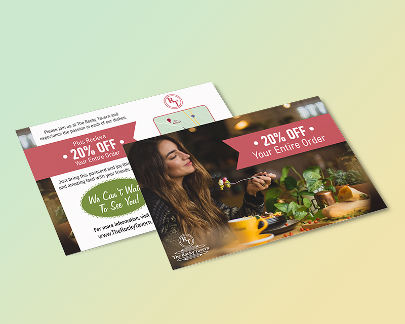
5x7 Postcards: Budget-friendly for promoting exclusive offers, holiday greetings, event save-the-dates, and company updates.
6x9 Postcards: This is the most popular postcard size because it's affordable and is larger than the typical mailpiece, meaning it stands out in mailboxes. This size is used by companies promoting a grand opening, a big sale, or advertising their services or products. Additionally, this postcard size qualifies for Postcard Commingling, meaning you can qualify for bulk mail discounts even if you aren't mailing your postcards in bulk (at least 200 recipients.)
6.25x9 Postcards: Companies often choose this postcard size for the same reason they choose 6x9 postcards. However, this size qualifies for Every Door Direct Mail (EDDM), where, for a low cost, you can mail your postcards to every address on a chosen mailing route without knowing the addresses.
6x11 Postcards: Besides being an EDDM-eligible postcard size, this size is perfect for making a big impact that can't be ignored.
In addition to the size, you need to decide the orientation in which you will design your postcard. Will you create a landscape or portrait postcard? While landscape is the most common, portrait style might be more effective depending on your information. For example, a portrait-style postcard might be more suitable if you include an infographic or bullet point list.
Select the Right Colors & Imagery
While your color choice may vary for specific holidays or events, in most situations, your colors must align with your brand. In addition, when planning what colors you will use, prepare for high contrast to ensure optimal readability and to make your postcard stand out. For example, choose a dark background like black or dark blue if you want your text to be white and yellow.
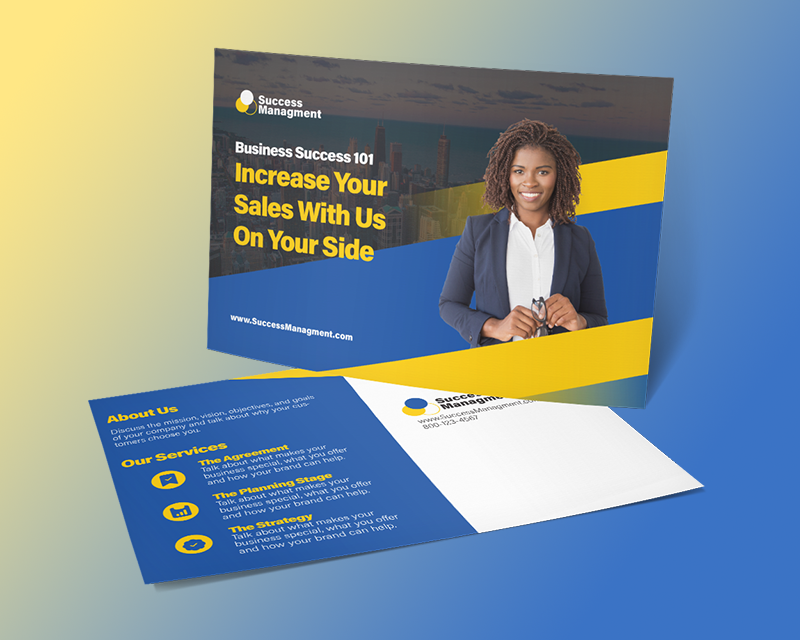
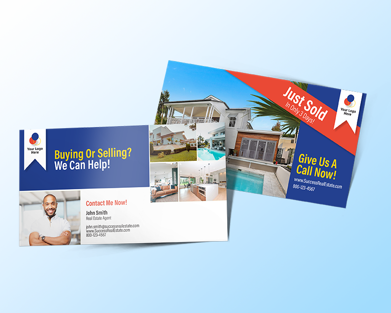
When choosing the imagery and other design elements for your postcard design, you want them to align with who your audience is as well as align with your messaging. For example, if you promote your lawn care services, include professionally taken images of lawns you have cared for to excite your audience about making their yard look the same. If you're a realtor targeting potential first-time home buyers, make sure any image with people aligns with the appropriate age group.
In addition, your photos need to be high-resolution (at least 300 dpi) and never sized up more than 20% to ensure they are printed crisp and clear. Getting an internal designer or hiring a professional photographer is often your best option. However, you can also use stock photos from companies like Shutterstock or Unsplash.
Craft the Perfect Message
The messaging of your postcard includes a few things, such as your headlines, the main copy, and your call to action.
For your headlines, you'll want to include one on the front of your postcard and potentially a second on the back, depending on what you are promoting. Each needs to be short, straight to the point, and compelling. Headlines are meant to intrigue your audience and encourage them to learn more.
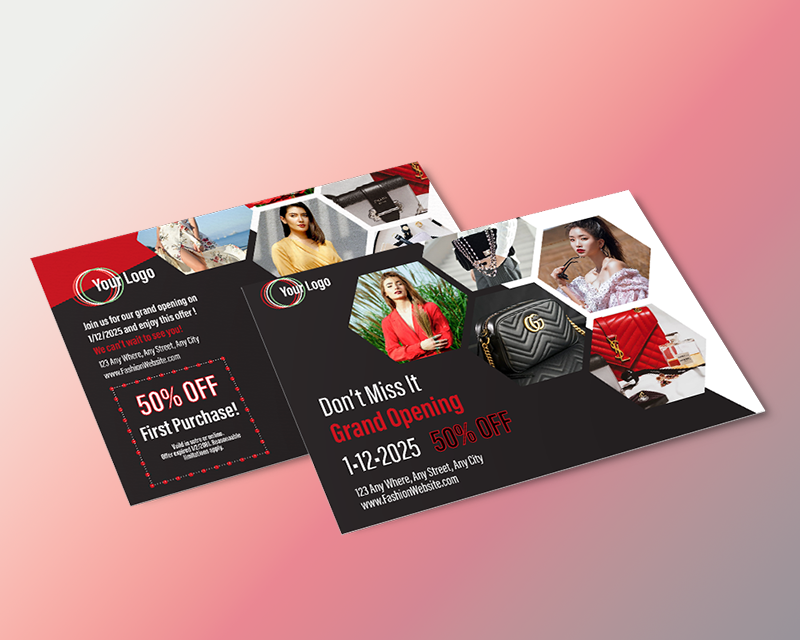
You have limited design space for the main copy, no matter what postcard size you choose. So, keep your copy clear, short, and engaging. A postcard aims to get an immediate response, so your audience must understand what your postcard is saying within seconds of seeing it.
Your call to action must attract and persuade your audience to act immediately. Include a discount or other incentive with a short message that makes your recipients eager. For example, "act now for 20% off" with a QR code leading to a product page to place an order offers clear directions that make your recipients feel they need to order immediately. And by adding a QR code, you give them a quick way to take you up on your offer.
Put Your Design Together & Follow Postal Requirements
Once you have your colors, imagery, and messaging planned out, it's time to put your postcard design together. First, you'll want to choose the right design software. While Adobe InDesign is the preferred software for designing printed materials, you can also use other platforms like Adobe Illustrator, Microsoft Publisher, or Canva if you can export your file as a PDF. From there, it's important to take advantage of a postcard design template, which we have available for you in various sizes and file types at the top of this blog. Once you download your desired template, just place it in a separate layer in your design platform and begin designing on top of it.
Using a template will ensure that your design is set to the correct size and has the proper bleed and margin space needed to print at the highest quality. In addition, our templates include guidelines for where the mailing panel and indicia need to be. This is a 4" x 2.25" area that needs to be left blank, and it is critical that you leave it blank so your design follows the USPS requirements.
When putting your design together, keep font size, font choice, negative space, and composition in mind. You want your font to be easily read and align with your brand. Headlines need to be large and bold, your primary copy concise, and you want to ensure your images, design elements, and text aren't too close together and flow as if they are telling a story. In addition, you need to include your logo and company name on both sides of the postcard to ensure optimal brand exposure.
Contact your printer's design team if you feel uncomfortable designing your postcard or need assistance and additional guidance.
Choose the Right Postcard Printing Company
When choosing a printing company, it's essential to find one that offers not only superior quality, fast speeds, low prices, design templates, and free samples but also in-house mailing services. This is incredibly important when printing postcards as, more times than not, postcards are used within a direct mail campaign. By choosing a company that offers print and direct mail services, they can help you cleanse your mailing list or help you build an entirely new mailing list to target a new audience. In addition, they'll handle the addressing and sorting and mail them directly to your audience as soon as they are printed, saving you time and money.
Mistakes to Avoid When Making a Postcard
Choosing to Small of a Postcard
Suppose you have a lot of details to include in your postcard, such as images, contact information, around 100 words, a long headline, coupon cutouts, and other design elements. In that case, you need a large postcard like a 6x9 or 6x11. While you can save a few dollars by choosing a small postcard like a 4x6, 4.25x6, or 5x7, it decreases its effectiveness if your design appears cramped. Choose a smaller postcard only when you have a short message to send.
Not Providing an Incentive
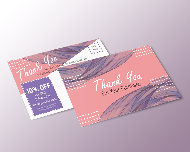
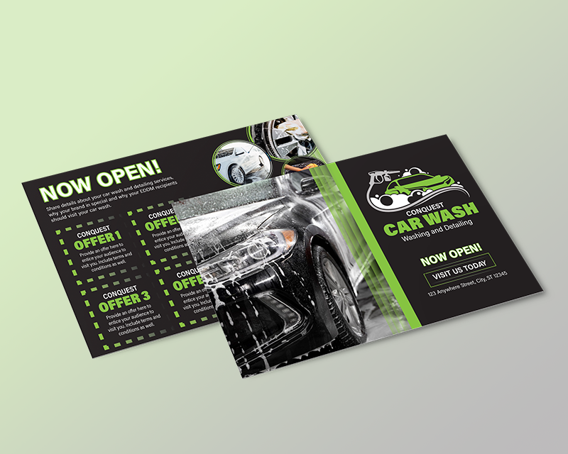
Sending postcards to advertise company updates, new product launches, holiday greetings, birthday cards, and thank notes are great ways to encourage sales and repeat business. However, you can further increase your ROI by including an offer or incentive. For example, if sending first-time customers a thank you postcard, include a promo code with a discount to encourage them to place another order. For postcards promoting your auto shop's services, include a coupon cutout with a 15% discount to entice your audience to schedule a service appointment.
Not Using a Postcard Design Template
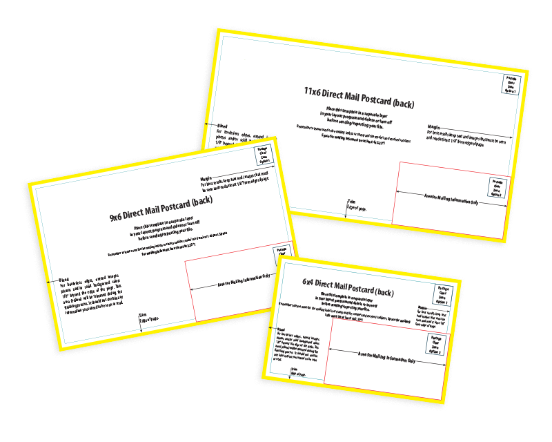
When it comes to designing a postcard, it's essential that you follow the printing guidelines and the USPS mailing requirements. For printing, you must ensure your postcard is created at the right size and has the proper bleed and margin space. Bleed refers to the area beyond the edge of the actual postcard where you need your background design elements to extend to ensure there are no thin white lines on the edge of your postcard during the trimming process. Margin space refers to the 0.125" border in from the edge of the postcard, where you need to keep all text and imagery that you do not want too close to the edge. Regarding the USPS requirements, you need to leave a 4" x 2.25" blank area within your postcard design for the mailing information.
Using a postcard design template, you'll be provided guides on where to place your design elements and where not, to ensure your postcard is printed perfectly and ready to mail.
Forgetting a Way to Track Results
If you can't measure the performance of your postcard campaign, then you can't learn from your campaign and improve your approach for future campaigns. Because of this, it's crucial that you include a way to measure the effectiveness of your postcards. There are many ways to track the performance of print advertisements, including QR codes, promo codes, unique URLs with UTM tracking codes, coupon cutouts, or a call tracking number.
Making it Hard for Recipients to Take Action
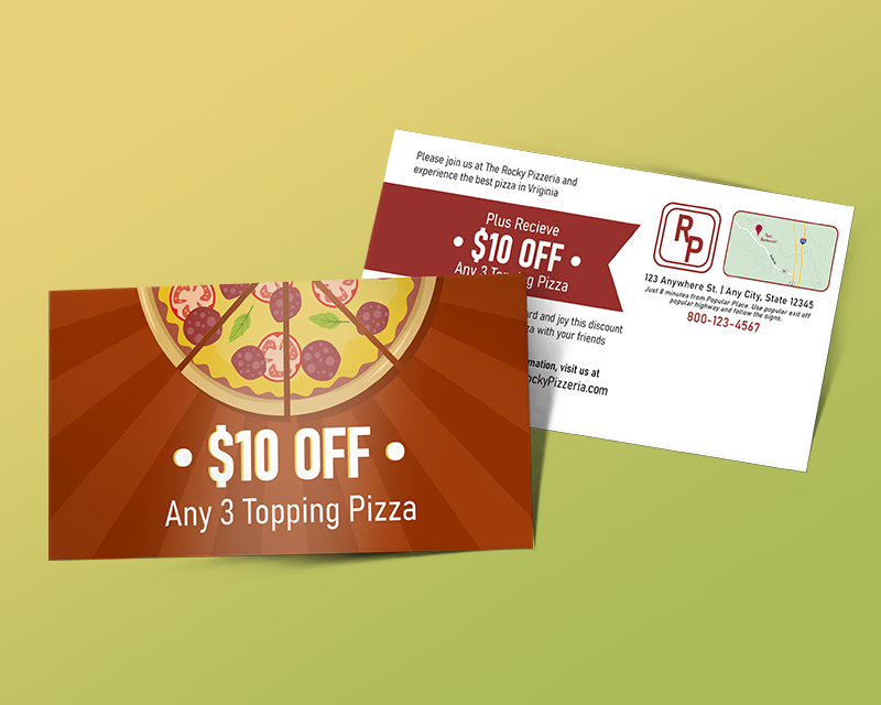
Very few will type in a long URL if you're directing your audience to a web page, even if you have a great offer. Because of this, it's essential that you make it as easy as possible for your audience to take action. One of the best ways to accomplish this is by including QR codes in your print ads. By doing so, your audience can quickly and easily scan the code on your postcard and be directed to your product or service page. You can also use a URL shortener like Bitly to create an easy-to-remember, short URL that is easier to type in while still directing recipients to the appropriate web page.
Conclusion: Make a Postcard Your Audience Can’t Ignore
Now that you have downloaded your postcard template and have read through our step-by-step guide, you're ready to make a postcard your audience can't ignore. Remember, a well-designed postcard has the power to drive immediate responses, increase sales, strengthen customer relationships, and build strong brand awareness.
The next step is to print and distribute your postcards. At Kingston Printing, you get more than just professional-looking, high-quality postcards. You gain print experience and dedication to fast speeds, competitive pricing, friendly and attentive service, and resources like our free design templates, design help, and free samples. In addition, we're experts in direct mail. With our in-house direct mail services, we'll save you time and money by mailing your postcards directly to your audience, whether by using a mailing list you already have or by helping you create a custom-targeted mailing list.
Head to our postcard product page today for instant pricing and see all we can offer.
Order Your Postcards Today


