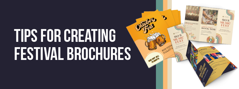
The festival market is extremely competitive. With millions of people attending them each year, you need to create a brochure that successfully gets the word out about your festival to generate a greater turnout.
Whether you’re planning to host a music, art, film, wine, or food festival, or looking for inspiration to help with a design, you’ve come to the right place.
These examples, templates, and tips will help you create an effective festival brochure.
Tips for Creating a Festival Brochure
Tip 1: Plan Out What is Needed for Your Festival Brochure
Before you begin planning out your festival brochure content, you need to determine the purpose and define your audience.
What do you want to achieve with your brochure? Who is your brochure intended for? Understanding this will help you outline what you need to include in your brochure and create a design that appeals to your specific audience.
Once you know the answers to these questions, you need to list out the most important components. To help, here are a few things that are typically covered in festival brochures:
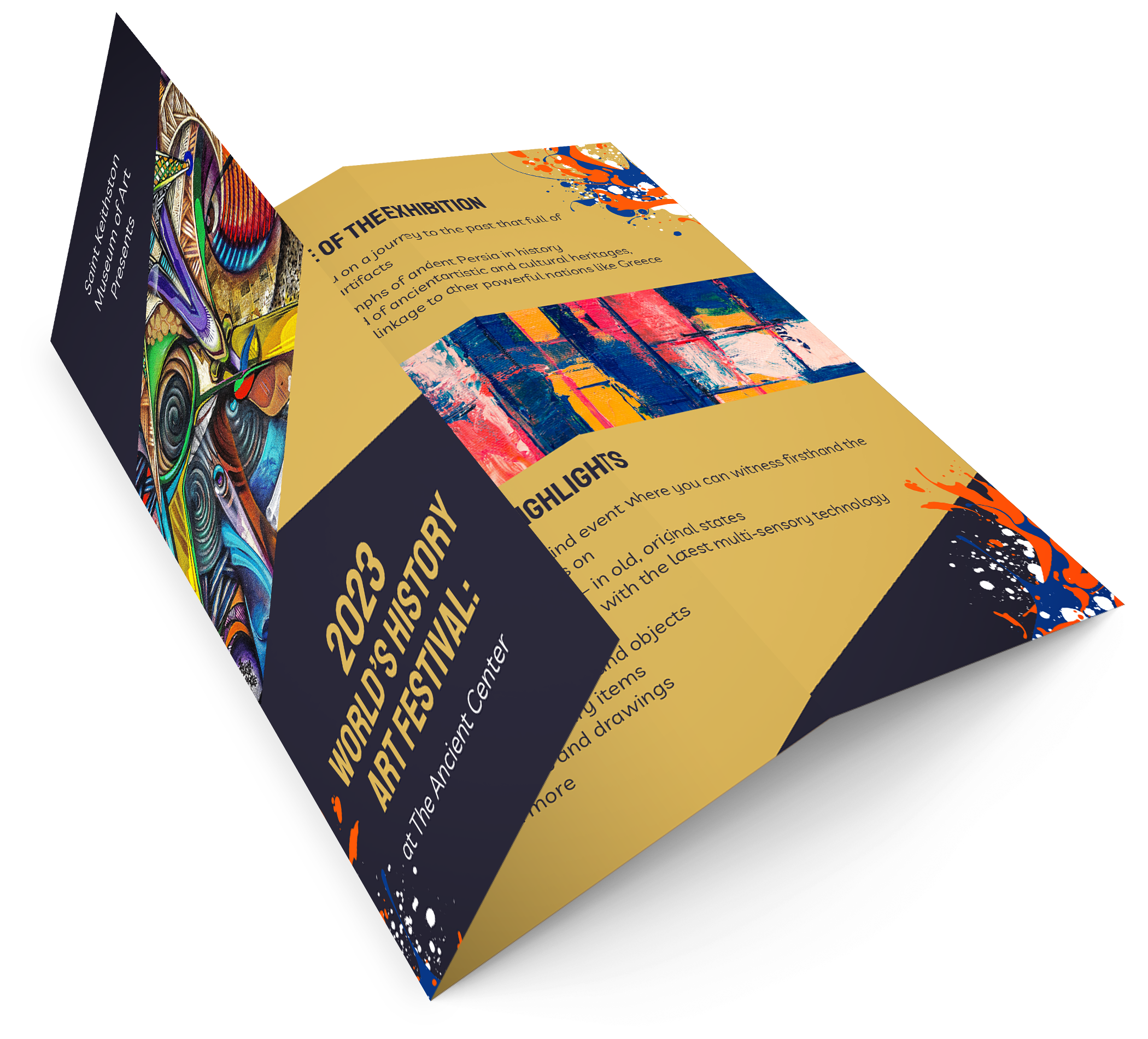
Festival type and description – Are you planning for a beer fest, art fest, or jazz fest? Make sure to include the festival type and a brief description. For example, is your art festival celebrating art history or local artists? These details should be displayed on the cover of your brochure.
When and where your festival takes place – You need to include the date, time, and location where your festival takes place so your audience can plan accordingly.
Festival logo – If your festival has its own logo, it’s important that you include your logo and any other branded elements in your festival brochure design. This will let your audience know who is hosting the event as well as strengthen brand awareness.
Pricing and entry details to attend – Some festivals require that attendees purchase tickets or pay a fee at entry. If this is the case for your festival, include all pricing and entry details in an easy to find place within your event brochure design.
Navigation and parking instructions – Whether your festival is geared toward a local audience or people from across the country are invited to attend, include details on parking. This includes details on whether your audience needs to park on the street, in a nearby parking lot, or if they must pay to park.
For some festivals, including a map and directions to the festival are helpful.
Social media handles – Including your social media accounts in your festival brochure design is a great way to increase exposure and help your audience stay updated with everything surrounding your festival.
Performers – If you have artists performing at your festival, include their names and details on when they will perform.
Activities to participate in – If there are games, contests, tastings, or a “how to” demonstration at your festival, make sure to cover each activity your audience can participate in.
Timetable – When will each performer perform and when and where will each activity take place? Highlight these details in your festival brochure so your audience is fully prepared to enjoy everything they want to.
Tip 2: Select the Right Brochure for Your Festival
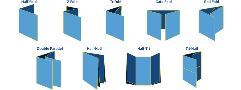
There are 9 standard types of brochures with various sizes and it’s important that you choose the right one when creating a festival brochure.
Multi-day festivals and festivals that require you to share a lot of details with your audience typically work best with a larger brochure with more folds. For example, if there are several activities to participate in and a large lineup of performers, then a 5.5x8.5 no-fold brochure would be too small. You would want to opt for something larger with more panels, like a 9x12 trifold brochure or an 8.5x14 roll-fold brochure. However, if your festival is a multi-day event, you need to keep in mind that some of your attendees may carry your brochure around with them. In this case, you want to choose a brochure that is large enough to display every needed detail but that also folds up small enough to easily carry. Large, easy-to-carry brochures include the half/half fold and the half-tri fold brochure.
The z-fold, trifold, roll fold, and half-trifold brochures are some of the most popular types of brochures for festivals. Below is an image demonstrating the 9 standard brochure types so you can get an idea of how your festival brochure content could be displayed:
Tip 3: Take advantage of a Festival Brochure Template
Taking advantage of a festival brochure design template is the easiest way to successfully prepare your design for print. Templates help you in the design process by providing guides for laying out your event brochure content in the right size, with the right margin space and bleed.
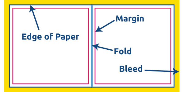
When printers and designers talk about margin, they are referring to the area where you shouldn’t place text or design elements that you want fully visible. It’s recommended that you keep all content at least 1/8 of an inch away from the edge of the page and brochure folds. This will prevent any details from being lost during the trimming process and will provide your design with a nice blank area to frame your event brochure content.
Bleed is the area where you should extend background colors and any other content you want placed on the very edge of the paper. It’s recommended that you extend these elements at least 1/8 of an inch out from the edge of the page. Bleed prevents any thin white lines from appearing on the edge of your brochure after it is trimmed to size.
Brochure templates have these parameters in place so that all you have to do is follow the guidelines and if you ask your printer, they’ll be able to provide you with a free one.
Tip 4: Gather Images and Other Design Elements
Include compelling and high-quality images that appeal to your target audience and illustrate your festival to generate greater engagement.
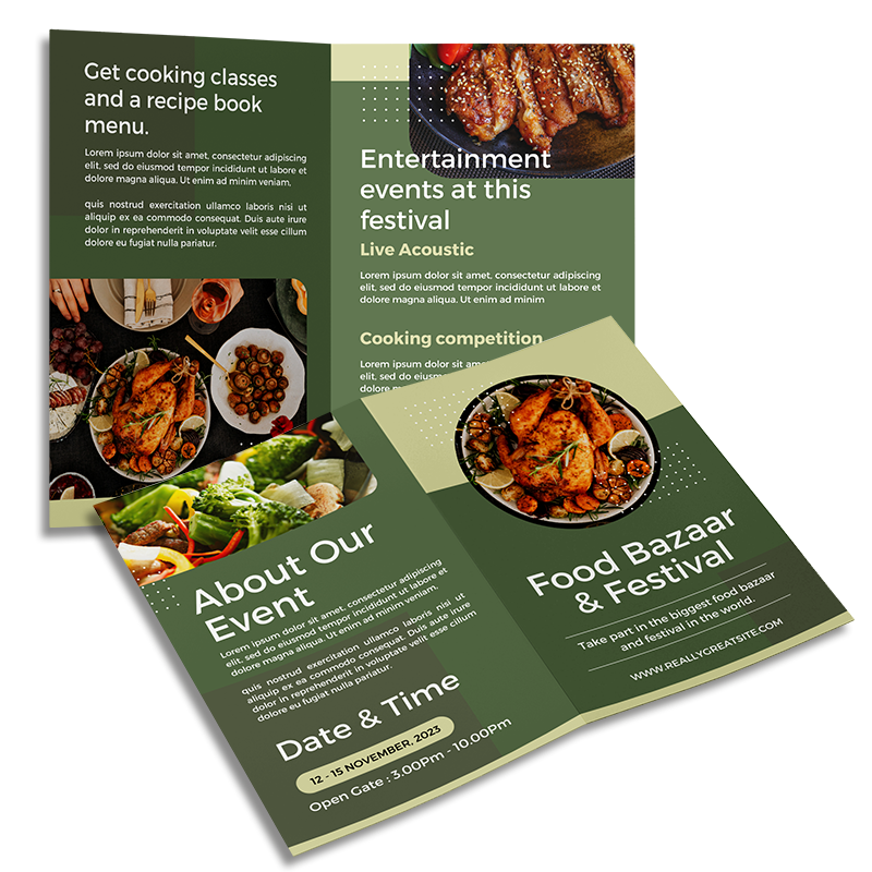
Some ideas include images of performers for your music festival, photos of delicious dishes you’ll have at your food fest, or images of people enjoying wine tastings for your wine festival brochure.
If your images align with the type of festival you’re promoting and reflect who your audience is, your festival brochure will stand out.
Keep in mind that you don’t necessarily have to use photographs. Design elements such as patterns, graphics, color blocks, or shapes and lines that highlight important messages are also great ways to bring your festival brochure to life. Use each festival brochure example in this article to get ideas of how you can display images and graphics in your brochure.
Tip 5: Put Your Festival Brochure Design Together
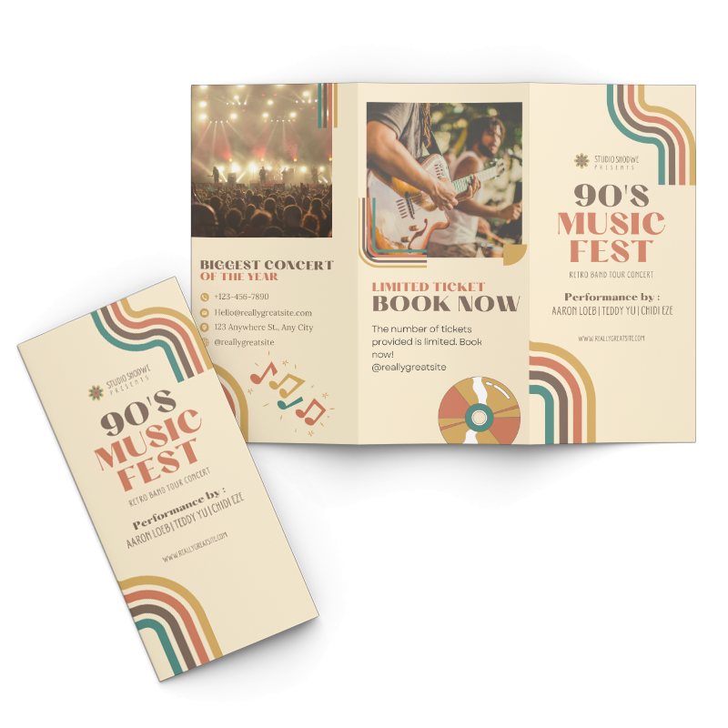
When putting your festival brochure design together, you need to lay out everything in a way that will effectively showcase your festival and what it has to offer. Every design element should be organized and displayed in an easy-to-understand manner and flow cohesively from one panel to the next.
Your logo and festival name should always be on the cover of your brochure. From there you need to decide where the other details should be placed. For example, should the date, time, and location be on the cover as well or on the next visible panel when the brochure is unfolded?
Don’t forget to place certain information near each other. Pricing information and parking details should be near your contact information for easy access if anyone has questions. Your list of performers and activities should include or be near your festival schedule.
Tip 6: Don’t Use too Much Text or Too Much Imagery
Too many images or too much text can cause your festival brochure design to become overwhelming and hard to understand. You need to have a balanced image-to-text ratio throughout your entire event brochure.
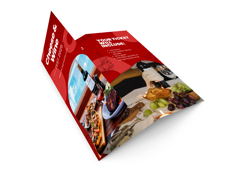
Keep copy and headlines clear and concise when writing out the descriptions of your festival and its events. Highlight only the important information like what makes your festival special, when and where your event takes place, and how your audience can attend. If you need to go into great detail about something, consider including a QR code that your audience can scan to learn more.
While images and graphics are incredibly important for any event brochure design, you need to be careful that you only use images that make sense. Consider the placement of your images as well. For example, you could have a single image on a panel of its own to break up two text heavy panels.
Tip 7: Align Your Color Palette with What Makes Your Festival Unique
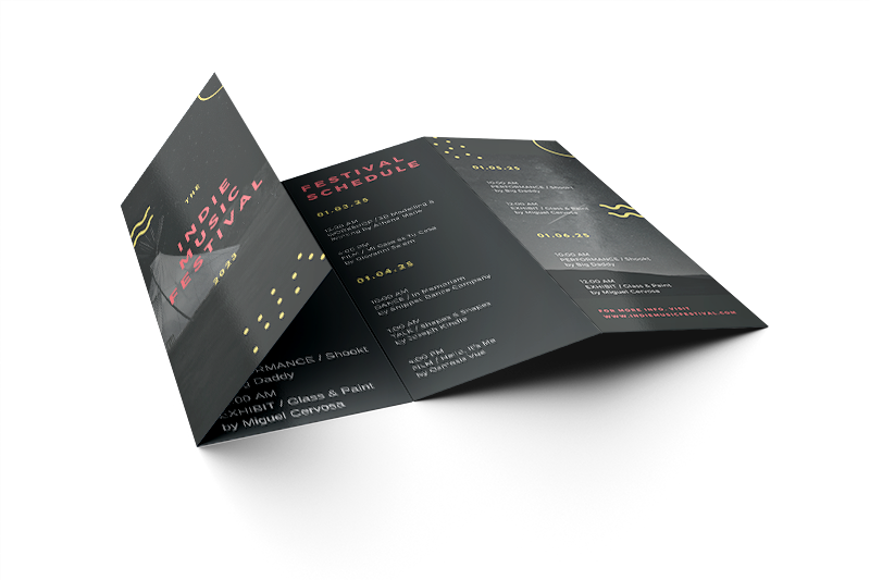
When choosing colors for your festival brochure, use colors that align with your brand and your festival’s theme or culture.
Festivals are all about gathering and connecting with others with similar interests and you want the colors you select for your design to reflect the mood that makes your festival unique and the message behind your event.
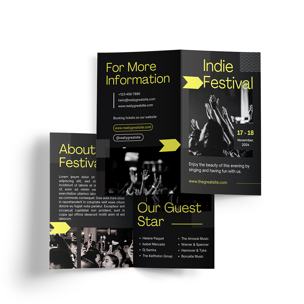
The festival brochure design above is a perfect example you can use for inspiration. The designer did a great job illustrating the vibe of this multi-day music fest through black-and-white imagery and contrasting pops of color. They also make each detail stand out by using light-colored text and design elements on a dark background.
Tip 8: Include a Call to Action Your Audience Can’t Refuse
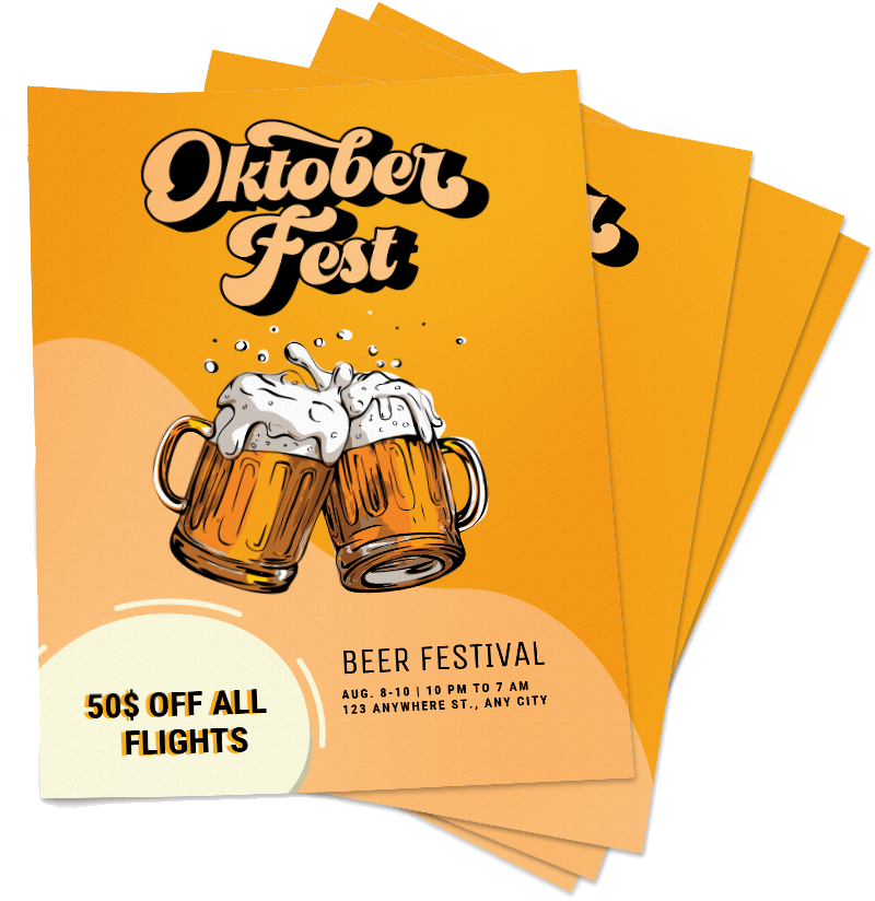
A call to action, or CTA, refers to the “next step” you want your brochure recipients to take. A good call to action will attract your audience to take that next step.
Ultimately, the main goal of a festival brochure is to get people to attend so you need to carefully think about what would intrigue your target audience.
If you’re offering free admission, place “free admission” on the cover of your brochure in a bold easy-to-read font. If your audience needs to purchase tickets or pay an entry fee, consider including a discount or other incentive. You could even boost exposure by asking your audience to use a special hashtag on social media to receive 10% off.
Tip 9: Proofread Your Festival Brochure
Festivals are typically attended by hundreds of guests and the last thing you want is to hand out your festival brochure and there be a typo or blurry image.
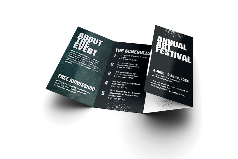
Carefully review your event brochure content for typos, low resolution or fuzzy images, incorrect colors, grammatical errors, and any other inaccuracies. Then ask a friend to proofread your content as well.
Luckily, before your festival brochure is printed, your printer will provide you with a proof that notifies you of any color, layout, or image quality errors. However, it’s important that you review your design to make sure everything is set up exactly how you want.
Tip 10: Find the Right Festival Brochure Printer
After you have your festival brochure design put together, it’s time to find the right printer.
When looking for a company to print your event brochure, search for one that offers fast turnarounds, design services, a variety of festival brochure options—including folds, paper options, and finishes—and a responsive customer service team who can advise you in creating a festival brochure that meets your goals and budget.
At Kingston Printing, we provide all of this and more! If you’re ready to bring your festival brochure to life, visit our custom quote page to request your free quote today.
Get A Quote For Your Festival Brochures Now!


