There are several elements to consider when designing for print. Between the design itself, the final touches and even the paper type, you’ll have your hands full trying get everything just right. One other crucial element when setting up your design is the color mode.
What is RGB Color Mode?
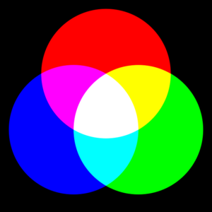
RGB = Red, Green and Blue. This mode uses the three base colors to form almost every color you can imagine. Red, green and blue are additive colors, meaning that the RGB color mode creates new colors by adding different quantities of the three primary colors. RGB is typically associated with computer monitors and other displays. TV’s use RGB color as well as most cameras and scanners. RGB is used throughout most applications because it offers the widest selection of colors. Most photo editors use RGB, which is where things get tricky when designing for print.

What is CMYK Color Mode?
Whereas RGB uses additive types of color, CMYK uses subtractive colors. CMYK represents Cyan, Magenta, Yellow and Key (aka black). The main difference between the two? When you combine all the colors of RGB in varying amounts, the result is the color white. With CMYK, the more colors you add together, the darker the color you end up with. CMYK isn’t used as often for basic printing as in previous years since many home printers can now actually print using the full RGB spectrum. However, CMYK is still used by most printing companies.
So How Do I Know Which Color Mode to Use?
One of the most common design for print mistakes we see is the lack of differentiation between RGB and CMYK. Designers often use an application like Photoshop to create a design for print. Photoshop, by default uses the RGB color mode because the tool is mostly used to create digital work, like websites, or images that are edited and displayed online.
This is where the problem lies. When an RGB design is printed via a CMYK printing process, the colors can appear differently if not converted. So which mode should I use? Here are some examples:
- If you’re designing for digital mediums, you’ll pretty much always want to use the RGB color mode. If you’re designing for print however, there are times when you will want to use the CMYK color mode.
- For print, work in RGB and then convert your project to CMYK before you send it off to the printer. This will allow you to create your design with the full RGB spectrum, giving you freedom to choose from endless color variations.
- An exception to the rule is if your design is mostly gray. In that case you should consider designing in CMYK as gray is one of the hardest colors to control.
How To Color Correct For Print
When using Photoshop, correcting color is fairly simple. Click on the ‘View’ menu, then select ‘Proof Colors.’ Photoshop will then show you a preview of the design once it’s been converted to CMYK. You’ll likely notice a few differences in colors, particularly blue and green, but this is also fixable. If the blues look a bit different, you can use a ‘Selective Color’ adjustment layer. This will allow you to remove some of the magenta and replace it with extra cyan and black. This will help you avoid having your blues turn purple during the printing process. If your greens are appearing a bit off, you can still use the ‘Selective Color’ adjustment layer – just remove a little cyan and replace it for a little yellow this time..
Overall, designing for print is quite straightforward as long as you’re aware of the differences between RGB and CMYK along with the possible color variations between on-screen media and printed media. If you still need advice, feel free to contact us at Kingston Printing and our print experts will be happy to assist!


